A live learning product, and the work of making it coherent
role
Product Designer
client
Banao Technologies
status
ONGOING · IN REPAIR
timeframe
Ongoing
UX
AUDIT
LIVE
Problem
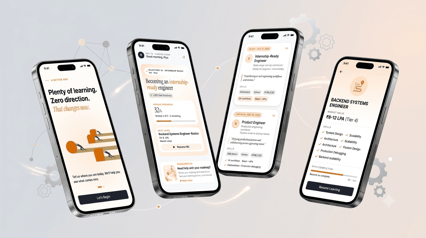
Vidya was live and working, and every screen looked fine on its own. Read as a system, it contradicted itself — the same numbers disagreed across screens, and the home page pointed users away from the path the product is built around.
Solution
I audited it as a whole rather than screen by screen, found the contradictions that only appear in aggregate, and I'm working through them against a single set of rules.
What I worked on
01
The diagnosis
The home screen argued against the product
Vidya’s premise is that the system decides what you do next. The home screen showed browse rows, counts and “view all” — the furniture of a catalogue. The product said follow the path; the screen said pick something.
The numbers disagreed with each other
The same module reported a different lesson count in two places. Progress read one value on one screen and another elsewhere. Each screen was internally coherent. Together they told the user the product didn’t know what was true.
The content was labelled as machine-made
“Generated by AI” badges sat on the learning material. For a product asking someone to trust its judgment about their career, flagging the material as machine-produced works against the thing it’s selling.
Nothing was designed for a bad connection
The product is voice-first and aimed at users on mid-range Android in tier-2 and tier-3 India. There were no error, empty, offline, low-bandwidth or interrupted-session states. For that user the degraded state isn’t an edge case.
02
What I’m changing
On the home screen
The catalogue furniture goes. The path already tells the user what’s next; choice at that moment is noise rather than freedom.
On the numbers
Lesson counts, progress and stages resolve to a single source of truth, so they read the same everywhere.
On density
No more than four pieces of information on screen at once, checked in review rather than left to judgment.
On trust
The AI badges go. The product should show what the system does for the user, not that a machine wrote it.
On the bad days
Designing the degraded states, starting with interrupted sessions and low bandwidth — the states this product’s users are actually in most often.